Exploring options in color
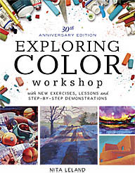
I'm always amused when I'm teaching a new class, whether in watercolor, color, collage or design, to find students who firmly avow that they do things in a certain way and aren't about to change. This isn't typical of every class, but now and then one shows up. All I can do is think to myself, "So, why are you here?" I try to be flexible and help them do what they want to do. Sometimes they come around to trying something different and sometimes they don't. We'll see how this plays out in my current color class. Most of the students are working on pigment studies and learning a lot about paint characteristics. A couple have skipped lightly over these, one saying she already knows all that and the other insisting that she is happy with her limited palette and doesn't like all the bright colors, which hurt her eyes. The first I gave an assignment to paint the four seasons using a different set of primaries for each one to better express the qualities of the season through color. She said, "I always use the same colors for all my paintings." Period. End of discussion. I asked her to try it, showing how Phthalo Blue makes a cooler, more wintry sky than French Ultramarine; how Lemon Yellow with Phthalo Blue makes a spring-ier green for trees. She agreed to try it, but I didn't feel she was happy about it. I looked at her sketches about halfway through and could see the seasons revealed in her colors. She finished them off beautifully and I think she was pleased, albeit a little grudgingly. I found the second student looking at pure-hue color wheels in my workbook and holding her head, as if in pain. She says she just wants to learn to use the colors she has. She doesn't think she needs more colors, because she can do what she wants with what she has to mix naturalistic landscape colors. I turned the workbook to a page where six color wheels show different combinations of primaries, including earth hues. In about two seconds she decided she had to have Indigo and maybe a couple other colors on those wheels. I think both are on the way to opening their minds about exploring color options to get more excitement in their work. We'll see in a couple of weeks what the next challenge brings.
Labels: color, color wheel, exploring color, green, landscape, paint, tutorials, workshop


3 Comments:
Found your blog through 'next blog' button...this is a great post! I'm always checking myself to make sure I'm NOT in a colour rut. Lately I've been challenging myself to use new colours/combinations in my paintings. Getting some interesting results, but it's amazing how difficult it can be to venture away from what feels 'safe'.
This encourages me to keep trying.
Thanks!
Glad to hear my blog struck a chord. Check out the Oct. 29 blog on compatible colors. It might help. Also, there are several articles and activities on color on my web site http://www.nitaleland.com Thanks for your comment.
I've been enjoying your blog for a few months. This post reminds me of a fellow student in a color theory class a few years ago. The class was based on a double-primary palette, but she -- a graphic design professor -- had brought along three pure primary colors . While everyone else worked with 6 colors and white, she worked with 3 colors and white and continually insisted she could get every color we could get. It was annoying even to me; I can't imagine how irritating was to the teacher. The class itself was very interesting, and I've used the color studies from that class many times since.
Post a Comment
<< Home