Pigment intensity in watercolor
For my watercolor class yesterday I demonstrated intensity, which is the difference between bright and dull colors. For some reason this is hard for a lot of artists to understand--that paint in a tube is high intensity or low intensity before it is mixed with another color. Several have used yellow ochre as the only yellow on their palettes and wonder why their paintings don't seem bright.
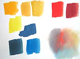 This chart shows what I did. I painted a swatch of yellow ochre at top-center. Then I made a swatch of gamboge to the far left leaving a space between them. The difference in intensity was obvious. Between the two I made a swatch of quinacridone gold, which they could see is brighter than ochre, but not as bright as gamboge. (Just below the gamboge is a cool lemon yellow, but I didn't emphasis the temperature difference, as that will be a later lesson.)
I continued the comparisons at the top-right with bright vermilion and low-intensity brown madder. In the lower left corner I painted indigo at left, phthalocyanine blue red shade to the right of indigo and indanthrone Blue just above. Again, the differences in intensity are obvious. But this was a revelation to many students, who hadn't previously observed this in their paints.
The mingling at the lower right shows how I test color schemes to see if I like the combinations, which I do when I begin a painting. I drop a little of each color onto damp paper, then push them around a bit to see what mixtures they make. This combination uses the low-intensity colors: brown madder, yellow ochre and indigo. I dropped in a tiny bit of vermilion to jazz up the brown madder. The low-intensity colors surrounding it make the color sing. This looks like an exciting combination for a painting.
Note: The colors on your monitor don't match the paints perfectly, so you need to do your own swatches. Also, brands may differ greatly in pigments having the same name.
This chart shows what I did. I painted a swatch of yellow ochre at top-center. Then I made a swatch of gamboge to the far left leaving a space between them. The difference in intensity was obvious. Between the two I made a swatch of quinacridone gold, which they could see is brighter than ochre, but not as bright as gamboge. (Just below the gamboge is a cool lemon yellow, but I didn't emphasis the temperature difference, as that will be a later lesson.)I continued the comparisons at the top-right with bright vermilion and low-intensity brown madder. In the lower left corner I painted indigo at left, phthalocyanine blue red shade to the right of indigo and indanthrone Blue just above. Again, the differences in intensity are obvious. But this was a revelation to many students, who hadn't previously observed this in their paints.
The mingling at the lower right shows how I test color schemes to see if I like the combinations, which I do when I begin a painting. I drop a little of each color onto damp paper, then push them around a bit to see what mixtures they make. This combination uses the low-intensity colors: brown madder, yellow ochre and indigo. I dropped in a tiny bit of vermilion to jazz up the brown madder. The low-intensity colors surrounding it make the color sing. This looks like an exciting combination for a painting.
Note: The colors on your monitor don't match the paints perfectly, so you need to do your own swatches. Also, brands may differ greatly in pigments having the same name.
Labels: intensity, mingling, paint, pigment, tutorials, watercolor
posted by Nita at 2:31 PM
![]()
![]()


0 Comments:
Post a Comment
<< Home